
GreenThumb Mobile App
A concept project for a garden store mobile app design.
OVERVIEW
Garden stores in the Bay Area are steadily growing in popularity as more and more people discover the joys of gardening.
THE PROBLEM
As the number of gardeners continues to climb across urban and suburban populations, so does the popularity of online garden retailers, particularly since the start of the pandemic as they try to avoid a trip to a physical store.
This project is a mobile app for a fictional garden supply store, GreenThumb.
While the physical store is popular among the locals, its geographical location serves as a limiting factor for the non-local population. Since other garden stores offer dedicated mobile apps for their customers to have garden supplies delivered to their homes, there is a need to create a product that can compete in the market, improve sales and increase customer satisfaction
HIGH LEVEL TIMELINE
April - June 2022
SCOPE
The scope of the project included user research, definition of the problem, developing potential solutions and refining and delivering a product
KEY GOALS
-
Create an app for a garden store
-
Make sure the app caters for gardeners of all levels of experience
-
Provide a safe and enjoyable shopping experience for users
MY ROLE
My role was UX/UI Designer and Researcher, designing up from conception to delivery
I initiated this project, performed user research, designed the mobile app and tested my design with users.
PROJECT TIMELINE
Week 1-2|Emphasize
Understand the user and define the problem that my design can solve
-
Conduct user research
-
Create personas
-
Write problem statements
Week 3-4|Define
Understand how my product can benefit the users and identify the new app's features
-
Create user journey maps
-
Write a value proposition
-
Build affinity map
-
Research competitors to identify users' biggest pain points
Week 5-7|Ideate
Come out with a lot of ideas of how to solve my users' problems
-
Conduct competitive audit
-
Identify unique opportunities for my product
-
Revise personas
-
Create a typical user flow
-
Draw storyboard
Week 8-10|Prototype & Test
Conduct usability studies to validate design decisions
-
Build Information Architecture map
-
Create paper and digital wireframes
-
Build mockups and Hi-Fi clickable prototype
-
Collect feedback & revise design
-
Define next steps
UNDERSTANDING THE USER
I followed the five stages of a design thinking process: empathize, define, ideate, prototype, and test.
The first stage of the process was all about users - who are they, what are their behaviors, what challenges do they have, and what are their goals? To find it out, I created a screener survey to send to a large audience. The results of the survey helped me choose a smaller group of users for in-person interviews. The main characteristics of the target audience were: 18+ years old, living in Bay Area and has bought a garden product online at least once.
I decided to choose in-person interviews as a main research method because I needed to collect in-depth information on people's opinions, experiences and feelings. This research method also helped me to uncover the major pain points.
MAIN PAINPOINTS

What users said
“What I don’t like sometimes when you buy from a different place is that sometimes they make you set up an account and I don’t like that”
“I am kind of like an unexperienced gardener, so what I was lacking [when buying tomato seeds] is to know what the difference is between certain terms that was specified. I wanted to have an info icon to see what does it mean, why should I prefer one vs another one?”

The results of my research suggested that there were two main types of users with diverse needs
I used the insights and the common patterns from the empathy maps to create two personas. To have a clear description of the user needs and motivations that should be addressed in the product, I created a problem statement for each persona
BREAKING DOWN THE PROCESS
WEEK 1-2 | EMPHASIZE
WEEK 3-4 | DEFINE
I conducted interviews and created empathy maps to understand the user I was designing for and to get a general idea of users’ needs, challenges and behaviors as they relate to purchasing garden supplies.
The results of the interview findings helped me identify the behaviors and challenges to do with shopping for garden products. To get a better overview of users' habits and frustrations I created empathy maps, which helped me organize the findings into themes.
The main goal for these two weeks was to come out with a meaningful and actionable problem statement to bring clarity and focus to my design process.
By synthesizing the observation about my users from the previous stage I scripted a typical experience of purchasing a garden product online for my personas by creating user journey maps because I wanted to find out any hidden pain points that were not identified during the interviews as well as any opportunities for improvement of the user experience. With this in mind, I started to think about how my product could benefit the users. I asked myself: What will my product do and why should the customers care? To answer these two questions I created a value proposition.
Using the results of the user research as well as user stories and problem statements I came up with a number of features for the new app. I used an affinity map to arrange all the ideas into four main categories so that I could have a clear list of the product features beneficial for the users. I then connected these features with the needs of the two personas I created in the Empathize stage. This helped me to avoid confirmation bias by making sure I identified the features that were truly valuable for the users.
I knew that there were a number of garden store apps on the market, so to make sure my app stood out among them I checked the competitors' apps, and read customer reviews to help me understand their biggest pain points. That gave me a solid list of features that I used to create my app’s unique value proposition:
"GreenThumb Garden store offers a wide range of quality garden products. The store is committed to providing the best customer service, including 24X7 access to live help via email, chat or phone; timely shipping updates, transparent return and refund information as well as product rating and review section to help our customers choose the best product for their needs. The store values its customers; that’s why they provide perks for the returning users, such as loyalty reward system and free samples with each 3rd order".
WEEK 5-7 | IDEATE


In this stage, my main goal was to come up with lots of ideas to start thinking of ways to solve my users’ problems
I wanted to understand the competitive landscape to get a better feeling of the products and features on the market. I identified direct and indirect competitors and compared their strengths and weaknesses through a competitive audit. This audit included four garden supply stores and helped me to identify the gaps in the market that my product could fill. It also highlighted the three main opportunities for my product to be helpful and unique.
Based on my research I now had a clear understanding of who my users were and how they behaved. Before starting the design process I wanted to get an overview of the needs the users will have when interacting with my product. Even though my product was yet to be designed, I tried to imagine how my users will behave by creating a user flow showing a path of a typical user completing a task from start to finish.
To be able to visualize the context of the users’ behaviors and goals I created two types of storyboards - big picture and close-ups. I used Andrew’s story as the basis for my storyboarding and wireframes, while keeping Rita’s needs in mind.
Andrew's story
Andrew wants to buy a new plant using his mobile phone. He uses Google search to find a good garden supply store and is overwhelmed by the number of available products. Being a new gardener with limited experience, he asks himself: “How can I make a good choice to get my plant?”. He finds an app for the “GreenThumb” garden store and opens it. The app has a lot of usefult information on each of the garden products and looks like a reliable store to purchase a plant. Andrew quickly makes his choice of the plant and he is happy, when it arrives in the mail a couple of days later. He’s had a great experience shopping with the“GreenThumb” app.
WEEK 8-10 | PROTOTYPE & TEST
In this stage, I created wireframes by translating user flow into individual frames followed by several rounds of testing and iterations. I created an Information Architecture map first to determine the basic structure of the global navigational elements.
I did several rounds of iterations following the two usability studies. Findings from the first study helped guide the designs from wireframes to mockups. The second study used a high-fidelity prototype and revealed what aspect of the mockup needed refining.
DESIGN EVOLUTION
I focused my design on the following screens.
-
Home: the go-to screen for users to navigate
-
Menu: where users can search for the product
-
Product: description of the product
-
Checkout: 5-screen checkout to guide the user through the purchase of the product
-
Help: access for help
-
My account: account settings and sign in feature
HOME Screen
Wireframe

Mockup
.png)
Hi-Fi

-
Wireframe: navigational menu with access to main product categories
-
Mockup: I improved screen navigation by removing the hamburger menu at the top as users had troubles finding the correct product. I moved the user profile logo to the bottom right hand corner as many users said it was where they were used to seeing it
-
Hi-Fi: I added a search bar at the top to facilitate the product search as most users preferred to use the search feature instead of the main menu. I changed the image size and used rounded corners to create a pleasing aesthetic effect and increase accessibility
MENU Screen
Wireframe

Mockup

Hi-Fi

-
Wireframe: Improved Filter and Sort menu for a quick and easy product search
-
Mockup: Following the usability studies findings I removed the hamburger menu in the top left-hand corner as many users found it inconvenient to use. I also changed the menu structure with the main menu being in the Home screen and the sub-menu in the second screen as users found this layout easier to navigate.
-
Hi-Fi: I added the search bar at the top as most users preferred to use the Search feature. I also added a shopping cart icon at the top to give users clear indication of the shopping cart state.
PRODUCT Screen
Wireframe
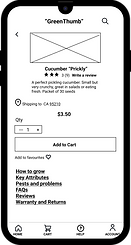
Mockup

Hi-Fi

-
Lo-Fi: Users found the product description font size too small and hard to read.
-
Mockup: I changed the font size to make it easier to read. The user testing revealed that the “Add to cart” button was not easily visible which most users found frustrating.
-
Hi-Fi: I changed the location of the “Add to cart” button, so that users could easily see it on the screen. The second round of testing also highlighted that the centrally aligned text in the product description was not easy to read, therefore I changed it to left-aligned to increase the readability.
Key Checkout Screens
Shopping cart
One of the challenges of the checkout process was to make it as easy and intuitive as possible. My first task was to create a good notification process to let users know when an item was added to the shopping cart, as well as provide easy access to the shopping cart.
Wireframe

Mockup
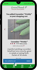
Hi-Fi
.png)
-
Lo-Fi: Users found the checkout process generally long and confusing
-
Mockup: I added a pop-up message to inform the users that an item was added to the shopping cart. I added visual distinction with the previous screen. However, the usability study revealed frustration with navigation to the shopping cart
-
Hi-Fi: To improve the user experience, I added a series of shopping cart overlay screens, giving the users the ability to edit and remove items within the cart as well as a way to immediately view the shopping cart
Payment
Wireframe

Mockup

Hi-Fi

-
Lo-Fi: Earlier user interviews revealed that loyalty reward program was important for the users
-
Mockup: Users needed a more descriptive way to see their reward points and to redeem them
-
Hi-Fi: I added an overlay screen so users knew the exact points balance and could easily redeem the points. I changed the “Redeemed” button to be more responsive so users had a clear outcome of the action
TITLE OF THE CALLOUT BLOCK
LESSONS LEARNED
As I designed this project I got to wear many hats - UX/UI Designer, UX Writer, and User Researcher. I used this as a learning opportunity as well as a chance to step out of my comfort zone.
-
I learned that I needed to incorporate the iterative design process elements, such as rapid user tests and prototyping in between the two main usability studies. I realized that I became too engrossed in the process which made me blind to the obvious things in the app design, which were easily seen by someone with fresh eyes. If I had has this feedback earlier it would have saved me time later down the line
-
I learned the importance of accessibility as a key element in a successful design that will improve the user experience of all users. For example, most users found it hard to read text that was centrally aligned as caused them unnecessary eye fatigue. By changing the text to the left aligned I improved the reading focus for all users
NEXT STEPS
-
Conduct another round of usability studies to validate if the earlier user feedback has been successfully addressed
-
Conduct more user research to expand on the existing app’s functionality